From Idea to Live Product: How I Designed and Built Vino
A product designer's honest account of vibe coding a wine collection app ! From first concept to deployed product :)
The V1 MVP of the app (better viewed on mobile) is now live at https://vino-app-jade.vercel.app
My Story
The Problem
I have a growing wine collection and no good way to manage it.
The apps that exist are either too complex, too ugly, or built for serious collectors with cellars full of investment-grade Burgundy. There was nothing that felt like it was made for someone who simply enjoys wine, wants to remember what they've tried, and occasionally wants to know what to open tonight.
So I decided to build it myself! The catch: I'm a product designer, not a developer. I had a clear vision and strong opinions about how it should feel but I had never shipped a coded product on my own before. This is the story of how I did it anyway.
Defining the Product
Before writing a single line of code or asking an AI to write one…. I spent time getting clear on what Vino actually needed to do.
I started with a simple question: What are the moments where someone needs this app?
Three scenarios kept coming up:
At the bottle shop — "I can't remember what I already have at home."
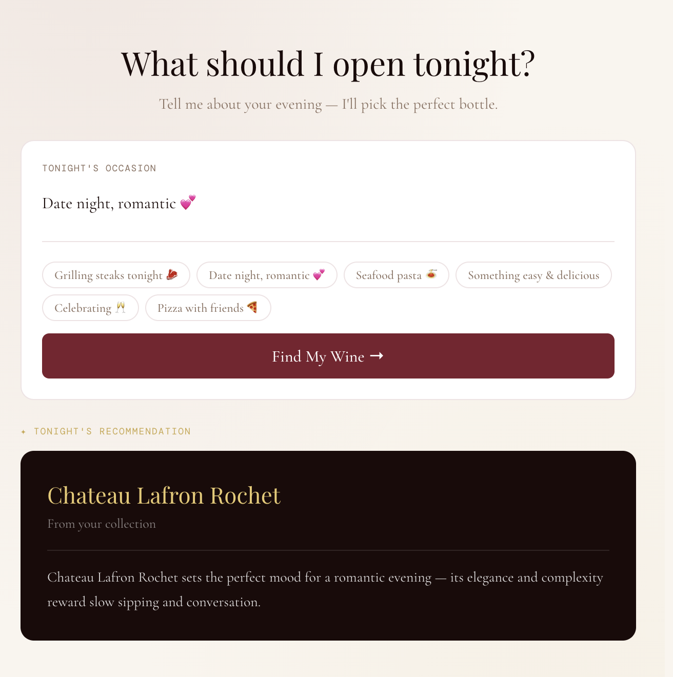
At dinner — "What should I open tonight with this meal?"
After trying something new — "I want to remember this wine before I forget it."
From those scenarios, I defined the core features:
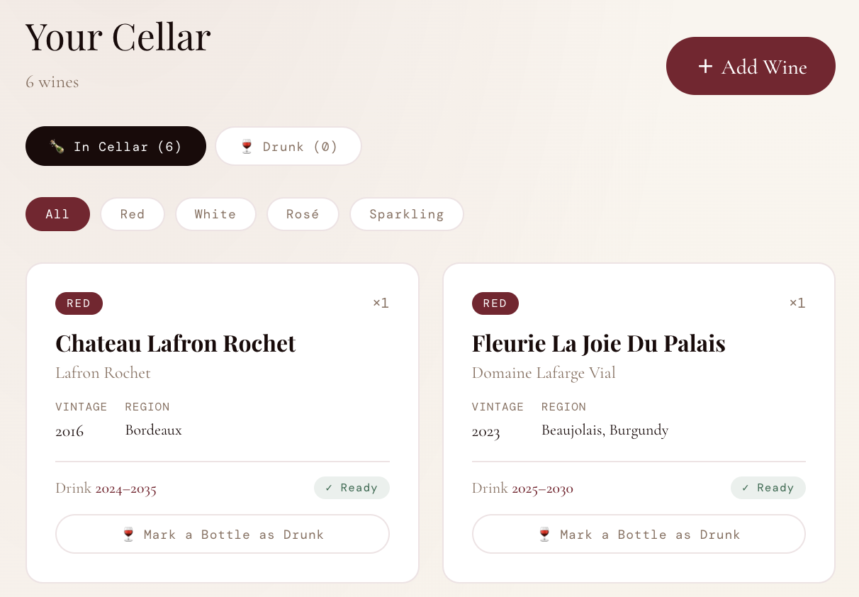
A collection tracker with type, vintage, region, and drink window
A "What to drink tonight?" recommendation tool
Tasting notes with ratings and tags
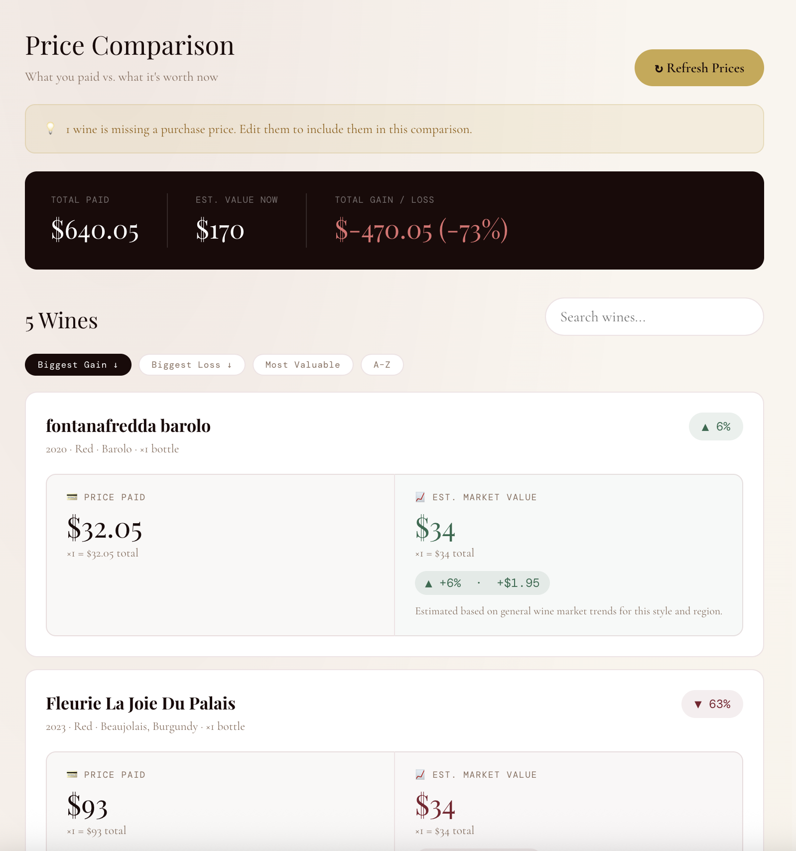
A price comparison tool to see what you paid vs. what it's worth now
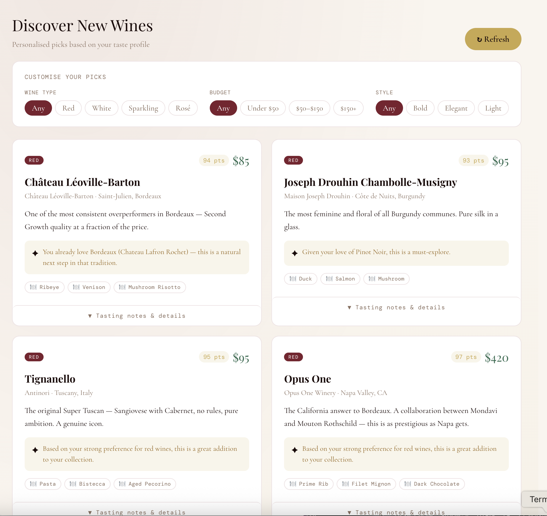
A discovery engine for finding new bottles based on your taste profile
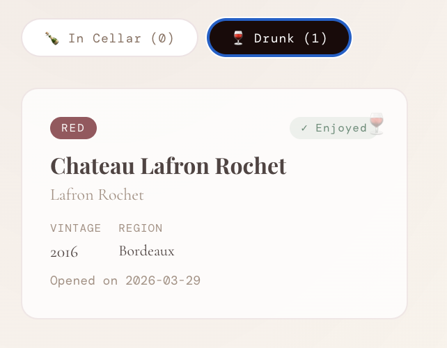
Drink tracking? Marking bottles as consumed and keeping a history
I deliberately kept scope tight. No social features. No marketplace. No barcode scanner (yet). Just the core loop: add, track, decide, remember.
Design Principles
With the feature set defined, I established three design principles that would guide every decision:
1. Refined, not clinical. Wine is a sensory, emotional experience. The app needed to feel like it belonged in that world! Think warm, elegant, considered. Not another productivity tool with a white background and blue buttons.
2. Accessible to beginners, respectful of enthusiasts. The language and UI needed to work for someone who just picked up their first bottle of Whispering Angel, and someone who has a spreadsheet tracking their Bordeaux futures. No jargon without explanation. No dumbing down for people who know more.
3. Every feature earns its place. If a feature didn't directly serve one of the three core scenarios, it didn't make the cut. This kept the product focused and the interface uncluttered.
The Build: Vibe Coding as a Design Tool
Here's where this project diverged from a typical design process.Rather than handing off specs to a developer, I used AI (specifically Claude) to build the product iteratively, describing what I wanted in plain language and refining based on what came back. This approach is increasingly being called "vibe coding." For a product designer, it's a genuinely powerful workflow. I could go directly from a design decision to a working implementation, see it rendered, and respond to it! All without waiting for a development cycle.
The process looked like this:
Describe → Review → Refine → Repeat.
I would describe a feature or interaction in detail but not in technical terms, but in design terms. "I want each wine card to show the drink window and a colour-coded status badge , green if it's ready to drink, amber if it's almost there, grey if it needs more time." The AI would implement it. I would review it against my design principles and iterate. This tight loop meant I could make dozens of micro-decisions in a single session that would typically take days of back-and-forth with a development team.
Key Design Decisions
The wine card. The central unit of the app. I went through several iterations before landing on the final format: type badge, quantity indicator, name, producer, vintage metadata, drink window, and status badge. They are all in a compact card that works in a grid. The challenge was hierarchy: the name needed to dominate, the metadata needed to be scannable, and the status needed to be immediately legible.
The price comparison tool. This was the most technically complex feature and the one that required the most design thinking. I wanted users to see paid vs. current value at a glance but without it feeling like a Bloomberg terminal. The solution was a side-by-side column layout: left panel for what you paid, right panel for estimated current value, with a colour-coded percentage badge and a one-sentence explanation of why the price moved.
The Drunk history tab. A small feature with outsized emotional value. When you mark a bottle as drunk, it doesn't just disappear but it moves to a history log with the date you opened it. Wine is about memories as much as it is about taste. The history tab honours that.
The confirmation modal for marking a bottle drunk. I added a confirmation step "This is your last bottle, it will move to your history" because the action is irreversible and slightly melancholy. Good UX accounts for the emotional weight of interactions, not just their function.
From Prototype to Product
Once the prototype was working in the browser, I took the additional step of deploying it as a real, live application.
This involved: Setting up a React project with Vite, Connecting a Supabase database so wine data persists across sessions, Deploying to Vercel so the app is accessible at a real URL.
As a designer who had never done this before, I'll be honest: it involved debugging, errors, and moments of genuine frustration. But working through those problems with AI assistance gave me a much deeper understanding of the technical constraints that shape design decisions. Understanding why something is hard to build makes you a better designer. The app is now live at https://vino-app-jade.vercel.app
What's Next
Vino is a working v1. The roadmap from here includes:
User accounts — so each person has their own private cellar
Barcode scanning — add a wine by pointing your camera at the label
Cellar analytics — deeper insights into drinking patterns, value trends, and collection gaps
Mobile app — the core use case (at the bottle shop, at dinner) is inherently mobile